Meter Movement · Volume 8
Dials, Faces & Enclosure
Drawing the custom meter face in MeterBasic, mapping time onto a linear scale, and the three ways to frame the meters as an instrument panel
Every other volume in this series is about making a needle point at the right number — the d’Arsonval physics that turns current into angle (Vol 2), the meters you choose (Vol 3), the PWM-into-a-resistor that drives them (Vol 4), the timebase that decides what each should read (Vol 5). This volume is about making the result look like something you would be glad to put on a shelf. A meter-movement clock is, more than any other clock in this hub, an aesthetic object: the engineering is gentle and the parts are cheap, so what separates a charming instrument from a science-fair lash-up is almost entirely the dial face and the enclosure. A perfectly calibrated clock behind a crooked, blurry, badly-lettered face is a disappointment; a face drawn with care over the same movement is the whole point. This volume covers how the collected build draws its faces in MeterBasic (Tonne Software), why the time scale comes out evenly spaced, the choices that make a face legible, and the three enclosure routes — the layered-MDF Simpson-260 panel the worked build uses, gutting a real vintage instrument, and a clean multi-meter panel — plus the cross-link to the Steampunk subproject.
8.1 Why the face is everything
A meter-movement clock is its dials. Strip the custom face off and you are left with a voltmeter reading 0.5 mA — interesting to nobody. Put the right face on and the same movement becomes a clock, and not just any clock: one that looks like a laboratory instrument, which is the look this whole hub is chasing (Vol 1, §1.1). The needle sweep is the motion; the face is the meaning. So the craft of the face deserves the same seriousness you would give the calibration — arguably more, because a calibration error of one percent is invisible across a room while a smeared label or an off-centre arc is the first thing a visitor sees.
8.1.1 The look you are after — a real instrument
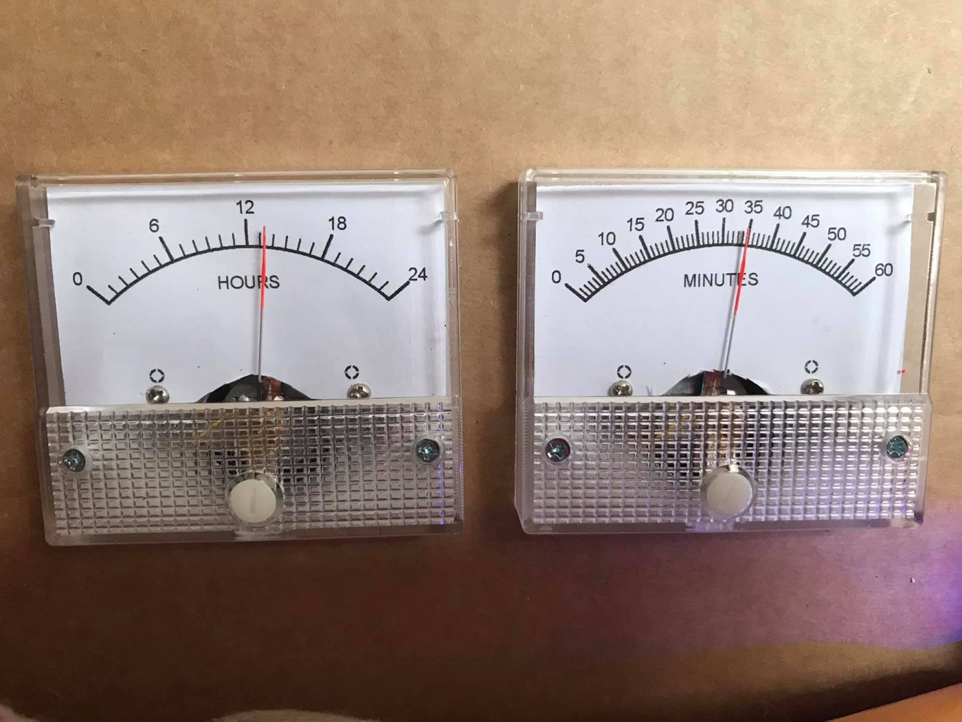
The target aesthetic is honest vintage test gear: a matte or eggshell-white dial, a thin black arc, crisp evenly-spaced tick marks, a restrained serif or condensed-sans numeral set, and one or two words of black lettering — HOURS, MINUTES, SECONDS — sitting under the arc where a real meter would print DC VOLTS or mA. The collected Multimeter Clock leans all the way into this: it does not merely resemble a meter, it reproduces a Simpson 260 multimeter’s styling, down to a CNC-engraved Simpson-260 fascia around the three movements (Vol 1, §1.2; §8.4 below). The owner’s two-meter “So Analog” build takes the same instinct more simply — two cheap plastic-bezel panel meters re-lettered 0–24 HOURS and 0–60 MINUTES, white dials, black numerals, a thin red pointer (Fig 8.3). Either way the rule is the same: the face should look like it was printed at a meter factory, not drawn in a hurry. Everything in §8.2 serves that rule.
8.1.2 Why a sloppy face ruins it
Three failures spoil a meter-clock face, and all are avoidable:
- A misregistered arc. If your re-drawn arc does not share the meter’s true pivot and radius, the needle will track above or below the printed scale across part of its travel — it reads correctly at zero and full scale but drifts in the middle. This is a geometry error, not a calibration error, and no amount of EEPROM trim fixes it (§8.2.1).
- Wrong spacing. Because the meter’s scale is linear (§8.3.1), the time ticks must be evenly spaced. A face copied from a non-linear meter — or hand-drawn by eye — puts the numbers in the wrong places and the clock reads wrong everywhere but the ends.
- Poor legibility. Too many ticks, a fussy font, labels crammed against the arc, or a grey-on-white that disappears at arm’s length. A meter face is read at a glance; it must be clean.
Get the geometry, the spacing, and the legibility right and the clock looks bought; get any one wrong and it looks homemade in the bad sense.
8.2 Designing faces in MeterBasic (Tonne Software)
The collected build draws its HOURS / MINUTES / SECONDS faces in MeterBasic, a free Windows program from Tonne Software written specifically to print analog-meter scales. (Its bigger sibling, Meter, is the paid version with more scale types; MeterBasic is enough for a clock.) The workflow is the same whichever you use: measure the movement, enter the scale, choose the ticks and labels, export, print, cut, fit, re-zero.

8.2.1 Measure the movement first
MeterBasic draws a scale to fit a specific meter, so before you touch the software you measure three things off the bare movement (face removed, or carefully over the old face):
- Pivot-to-arc radius — the distance from the needle’s pivot point to where the printed scale arc should sit (typically just inside the needle tip’s travel). This sets the radius of every tick.
- Arc start and end angles — the angle of the needle at mechanical zero (rest) and at full deflection. Cheap panel meters commonly sweep about 90°; a Simpson-style movement may sweep less. You measure these as the included angle of the fan the needle traces.
- Full-scale needle position — where the tip lands when the coil is at its rated full-scale current. This is the 12:00 / 60 end of the scale and must coincide with the meter’s true mechanical full-scale, or the geometry error of §8.1.2 creeps in.
A simple way to capture all three: drive the meter to a few known currents (rest, half-scale, full-scale) and photograph the needle straight-on each time, then measure the angles off the photo. MeterBasic accepts the radius and the start/end angles directly.
8.2.2 Enter the scale endpoints and ticks
With the geometry entered, you define the scale:
- Endpoints. The low end is 0 (needle at rest, zero current); the high end is your time full-scale — 12 for a 12-hour hours meter, 24 for a 24-hour one, 60 for minutes or seconds. “Full deflection” now means “twelve o’clock” (or 24, or 60).
- Major and minor ticks. Choose the major-tick interval and how many minor ticks subdivide it. The owner’s “So Analog” hours meter, for instance, prints majors every 6 hours (0, 6, 12, 18, 24) with minor ticks between; its minutes meter prints majors every 5 minutes (0, 5, 10 … 60) with finer minors (Fig 8.3). Pick a density you can actually read (§8.3.3).
- Numeric labels. Label the majors with the hour/minute numbers and add the word label — HOURS, MINUTES, or SECONDS — in the dial field under the arc, exactly where a real meter prints its quantity and unit.
8.2.3 Why no non-linear compensation is needed
This is the single most important fact for face design, and it is worth stating plainly: because the meter’s deflection is proportional to current (Vol 2, §2.2), and the driver is arranged to be linear (Vol 4), equal increments of time correspond to equal increments of angle. The scale is therefore evenly spaced — 6:00 sits exactly halfway between 0 and 12:00, 30 sits exactly halfway along the minutes arc. MeterBasic’s linear scale type does this for you; you do not add any square-law or logarithmic correction. The only time you would reach for a non-linear MeterBasic scale is if your drive were non-linear — for instance if you drove the coil through a circuit whose current was not proportional to the commanded value, or used a movement with a deliberately non-linear (e.g. dB / VU) original scale you were keeping. For the standard PWM-through-a-resistor drive of this series, the time scale is linear, full stop. (If you ever do need to linearise a misbehaving drive in firmware instead of on the face, that is the calibration table discussed in Vol 4 and Vol 5 — but the clean answer is a linear drive and a linear face.)
8.2.4 Export, print, cut, fit, re-zero
MeterBasic exports the finished scale as an image (and can print it directly to scale). The practical sequence:
- Print on the right stock. Plain paper is fine for a first fit; for the keeper, matte photo paper gives a dense black and a clean white, and printable vinyl (or a laser-printed transparency) survives handling and can be self-adhesive. Print at 1:1 — verify with a ruler against the on-screen dimensions, because printer scaling is the usual reason a face comes out slightly too big or small.
- Cut the face to the meter’s dial shape, including the slot the needle passes through and any holes for the dial screws and the zero-adjust.
- Fit it over the original face, or remove the original and mount the new one in its place. Going over the original is non-destructive and reversible; replacing it gives a flatter, cleaner result. Either way, register the new arc to the true pivot (§8.2.1).
- Re-zero the needle. Every panel meter has a mechanical zero-adjust screw on the bezel; after fitting, set the de-energised needle exactly on the printed 0 so rest reads 0:00. Then run the build’s scale-adjust calibration (Vol 4, Vol 5) so the full-scale end lands on 12:00 / 60. Geometry from MeterBasic, zero from the bezel screw, full-scale from the firmware trim — the three together make the needle tell the truth across the whole dial.
8.3 Scale-mapping choices
The geometry is mechanical; the scale is a design decision. Several choices shape how the clock reads, and they interact with the firmware of Vol 5.
8.3.1 12 vs 24-hour hours scale
The hours meter can read 0–12 or 0–24. A 12-hour face is the familiar clock reading and uses the whole sweep for half a day, so the resolution per hour is coarser-looking but each hour is a wide, easy angle; the trade-off is the usual a.m./p.m. ambiguity. A 24-hour face — what the owner chose for “So Analog” (0–24 HOURS, Fig 8.3) — reads unambiguously around the clock and has a pleasing “instrument” honesty, at the cost of squeezing twice as many hours into the same arc, so the numerals sit closer and a half-hour is a narrower wedge. Either works on a linear scale; it is purely how you label the same even spacing. (Note the owner’s minutes meter reads 0–60, the natural choice for minutes regardless of which hours convention you pick.)
8.3.2 Minutes, seconds, and whether the hours needle creeps
Minutes and seconds are almost always 0–60 — anything else fights the reader’s expectation. The more interesting choice is whether the hours needle advances smoothly or jumps on the hour. If the firmware drives the hours meter with the fractional hour (Vol 5) — hours plus minutes-as-a-fraction — then at 7:30 the hours needle sits halfway between 7 and 8, exactly as a real analog clock’s hour hand does, and the three needles tell a consistent story. If instead it snaps from 7 to 8 at the top of the hour, the hours needle disagrees with the minutes needle for most of every hour. The smooth, fractional drive is the nicer behaviour and costs nothing but a multiply in firmware; this series recommends it (Vol 5 covers the math, and the same trick lets the seconds meter sweep continuously rather than tick, smoothing the PWM into a glide — Vol 4, Vol 5). The face design has to expect the smooth needle: minor ticks between the hour numbers are what let the eye read 7:30 off a half-way needle.
8.3.3 Legibility — tick density, font, and labels
The face is read at a glance, so:
- Tick density. Enough minor ticks to read the in-between values, not so many they blur. For a 0–60 minutes meter, majors every 5 with a minor at each minute is the classic meter look but can be busy on a small dial; majors every 10 with minors every 2 is calmer. Match the density to the dial’s physical size.
- Font. A clean condensed sans or a restrained serif, sized so the numerals are crisp at arm’s length. Avoid decorative faces; the instrument look depends on plain numerals.
- The word labels. HOURS / MINUTES / SECONDS in the dial field, in the meter’s own styling, are what announce that this voltmeter is now a clock. On a Simpson-style face they sit where Sun(W/M)A / DC VOLTS would — and indeed the collected build’s engraved fascia keeps Simpson’s own typographic furniture around them (§8.4.1).
8.4 Enclosures
The enclosure frames the meters as an instrument panel. Three routes are worth knowing, in rough order of effort, plus the finishing touches that apply to all of them.

8.4.1 The collected layered-MDF Simpson-260 panel
The worked build’s case is layered ½-inch MDF, CNC-machined and painted to imitate a Simpson 260. The construction, visible in the collected article’s case photos, goes like this:
- Layered panels. Several ½” MDF panels are cut on the CNC and stacked — a front fascia with rectangular windows for the three meters, and backing layers that give the panel depth and hide the electronics behind it. The meters drop in from the front; the PIC board and supply live in the cavity behind.
- The v-carve. The Simpson-260 detail — the brand script, the range markings, the dial furniture — is v-carved into the painted face so it reads as crisp engraved lines.
- The contact-paper mask trick. This is the clever part. The face is primed and sprayed Krylon black first. Then contact paper (self-adhesive shelf liner) is laid over the black as a mask, and the detail is v-carved through the contact paper and into the MDF. The carving exposes bare MDF lines on a black field still protected by the surrounding mask. The whole face is then sprayed white; the white lands in the carved grooves and on the contact paper. Peeling the contact paper away lifts the white everywhere except inside the grooves — leaving crisp white detail on a black face with no fiddly hand-painting. It is a poor-maker’s version of fill-engraving, and it gives the authentic white-on-black Simpson look. (Fig 8.2A; the collected case photos show the stack, the carve, and the peeled result.)
This route needs CNC access and patience with paint, but it produces the most convincing “real instrument” panel of the three.
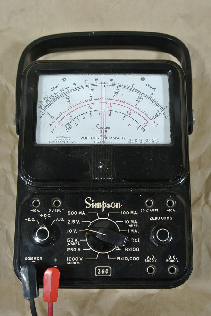
8.4.2 Repurposing one real vintage instrument
The opposite philosophy: instead of imitating a Simpson 260, use one. Gut a real vintage instrument — a dead Simpson 260 multimeter, a VU meter, an old panel voltmeter — keep its moving-coil movement, re-face it as one of your time meters, and hide the microcontroller and supply behind the original bezel. The result is genuinely the real thing, with a patina no paint can fake.
The catch is ethics and economics, and it deserves a clear line:
- Do not destroy a working collectible. A functioning Simpson 260 in good condition is a prized, still-useful instrument with collector value; gutting one to make a novelty clock is vandalism many makers (rightly) frown on. Use a dead unit, a parts unit, or a beaten example beyond economic repair — there are plenty on the used market with burnt-out movements, smashed meters, or missing internals that are perfect donors. Check that the movement you keep is sound even if the rest is junk.
- Prefer the cheapest viable donor. A generic surplus VU or panel meter gives much of the vintage look for a fraction of a 260’s price and carries no collector guilt. Save the real 260 for the rare case where you have a genuinely dead one.
Done with a dead donor, this is the most soulful enclosure — but it is a single big meter, so it suits a one-meter clock (hours-and-minutes encoded together, or a single quantity) more naturally than a three-needle build. (Fig 8.2B.)
8.4.3 A clean three-meter panel
The simplest and most flexible route: mount three matched panel meters in a row in a flat panel of wood, acrylic, or aluminium, label them HOURS / MINUTES / SECONDS, and put the electronics behind. There is no imitation here — it is an honest, modern instrument panel — and it is the easiest to lay out and the most legible.
- Spacing and layout. Use three identical meters so the bezels match; space them evenly with equal margins, centred, so the panel reads as a designed object rather than three meters that happened to land near each other. A horizontal row reads as hours-minutes-seconds left to right, like a digital clock’s fields.
- Materials and finishing. Hardwood (oiled or waxed) gives a warm, classic look; acrylic (especially smoked or frosted) suits a modern or backlit build; aluminium (brushed or anodised) suits a lab-instrument or aerospace look. Paint, if used, wants to be flat or eggshell, not gloss, to read as instrument-grade. Brass accents — knurled knobs, screws, a brass bezel ring, brass corner brackets — push the panel toward the vintage/Steampunk end (§8.5).
8.4.4 Backlighting the dials
Any of the three routes can be backlit. Many panel meters have a translucent dial and were originally lamp-lit from behind; a few warm-white LEDs in the cavity behind the meters, diffused, make the white dials glow and the needles stand out at night — and, on a build with translucent stock or cut-out lettering, can light the HOURS / MINUTES / SECONDS labels themselves. Keep the LEDs dim and warm: the charm is a soft instrument glow, not a bright panel. Run them off the same 9–12 V supply (Vol 1, §1.10) through a dropping resistor; a trimmer or a PWM channel lets you set the level. Backlighting is the cheapest single upgrade to the night-time look of any meter clock.
8.5 The Steampunk cross-link
The meter-movement clock sits one short step from Steampunk: it is already a cluster of brass-and-glass analog gauges, which is the Steampunk vocabulary almost by definition. Lean into it and you get exposed moving-coil meters with brass bezels, a wooden or riveted-brass panel, visible (tidy) wiring, knurled brass knobs for the time-set buttons, and the gauge-cluster aesthetic of a Victorian control panel. The owner’s collected sources even note this kinship — a commenter on the Multimeter Clock article remarks that “the steampunk sorts would love to make a version of it.” If that is the direction you want to take the enclosure — brass accents (§8.4.3), backlit dials (§8.4.4), exposed instruments — the Steampunk subproject deep dive in this hub is the reference for the materials, finishes, and the aesthetic of wrapping a working clock in a period instrument shell.1 A meter clock is one of the most natural Steampunk donors precisely because the meters need no disguise: they are the look.
References
- Multimeter Clock by abbtech (Alan Parekh, Hacked Gadgets), Instructables, 2010 — custom HOURS / MINUTES / SECONDS meter faces drawn in MeterBasic (Tonne Software); enclosure of layered ½-inch MDF, CNC v-carved with Simpson-260 detail, primed + Krylon black, contact-paper-masked, white detail v-carved and sprayed. Case construction photos, the engraved Simpson-260 fascia, and the comment thread (including the Steampunk remark) held in
02-inputs/Simpson/. Source: http://www.instructables.com/id/Multimeter-Clock/. - MeterBasic / Meter — Tonne Software analog-meter scale design program (free MeterBasic, paid Meter). Used to draw the collected build’s linear time scales. Source: https://tonnesoftware.com/meter.html.
- Two-meter “So Analog” parts (re-faced 0–24 HOURS, 0–60 MINUTES plastic-bezel panel meters),
02-inputs/Simpson/So Analog.jpg. - Cross-references: Vol 2 (linear scale, deflection ∝ current), Vol 4 (linear drive, calibration), Vol 5 (fractional-hour and smooth-seconds firmware), Vol 1 (§1.1 the instrument look, §1.2 the Simpson-260 imitation), and the Steampunk subproject deep dive (
../Steampunk/).
Footnotes
-
The Steampunk subproject (
../Steampunk/) in this Clocks hub documents the aesthetic of wrapping a working clock in a brass-and-glass period instrument shell; a meter-movement clock, being already a cluster of analog gauges, is a natural donor. The kinship is noted directly in the collected Multimeter Clock comment thread. ↩
Comments (0)