Steampunk · Volume 3
The Design Vocabulary
Brass, copper, wood, leather and glass; bezels, knurling, rivets and pipe; and the discipline of letting the display be the only bright thing
A style is a vocabulary before it is anything else — a finite set of materials, forms, and details that a builder draws on and that a viewer recognises. This volume sets out the vocabulary of the steampunk clock, item by item, with the reasoning behind each choice rather than a list of things to buy. Almost all of it traces back to the sources in Vol 2: an element is in the vocabulary because a real Victorian instrument, a piece of industrial plant, or an early aircraft panel used it for a reason, and the reason is usually still valid. Where an element is in the vocabulary only because the commercial style put it there, this volume says so.
The organisation runs from material, through hardware, to light and composition, which is roughly the order in which the decisions get made and exactly the reverse of the order in which they are noticed.
3.1 The metals
Brass is the default. It is the instrument metal of the nineteenth century, it machines and turns beautifully, it solders readily, it takes a patina in a controllable way, and it polishes to a warm colour that no other common metal matches. It is also soft, which is a real constraint: a brass screw driven repeatedly will round out, a brass thread will strip before a steel one, and a brass edge marks if it is looked at hard. Use brass where it is seen and steel where it is worked, and Vol 4 § 4.10’s service-path rule follows directly from that.
Copper is brass’s warmer, softer, more obviously aged sibling. Its great advantage is that it is available as plumbing stock — tube, elbows, tees, couplings, flanges, and valves, in standard sizes, from any hardware supplier, already designed to be soldered into rigid structures. That is why the pipe-frame archetype exists at all. Its characteristic patina runs through browns to the blue-greens of verdigris, which reads instantly as salvaged.

Bronze appears mainly as bought hardware — bushings, small castings, marine fittings — and reads as heavier and more marine than brass.
Nickel plate and chrome are the cool counterpoint. The collected lantern build used nickel-plated gauge bezels as its primary visible hardware, four per fixture, and the cool bright rings against warm wood are a large part of why that build reads as instrument rather than ornament. A build entirely in warm metal can look monotonous; one cool element gives the eye somewhere to land.
Steel and cast iron carry the industrial rather than the scientific half of the vocabulary: plate, angle, rivets, and the blued or japanned finishes of Vol 5. Steel is also where the strength is, so it belongs in fasteners, brackets, and anything structural that brass would be too soft for.
Aluminium is the anachronism. It is easy to work and it is what a modern builder has most of, but it is visually wrong for the period — too light in colour, too light in hand, and it neither patinates nor polishes to anything convincing. It is a good material for internal structure that will never be seen, and a poor one for a visible surface.
3.2 Wood
Wood does three jobs at once: it supplies visual warmth against the metal, it is the structural material of the dominant plinth archetype, and — the job that matters most in Vol 6 — it is an insulator, which makes a wooden carcass the most forgiving safety topology available for a high-voltage display.
The species that appear over and over in the collected material are walnut, mahogany, and maple, which is not an accident. Walnut and mahogany are the dark, fine-grained, reddish-brown cabinet woods of nineteenth-century instrument cases; maple is the pale contrast. The collected lantern build used walnut and maple together precisely for that contrast, laminated so the boundary between them is a visible feature (Vol 4 § 4.3.3). Oak reads later and more domestic; pine reads as packing case and is difficult to make convincing at any price.
Two practical notes. Figured or highly-grained stock competes with the display for attention and is best kept to the base rather than the face immediately around the tubes. And wood moves with humidity, so a hardwood case with a captured sheet of acrylic or glass needs the captured part to have somewhere to go.
3.3 Glass and acrylic
Glass is the period-correct transparent material and it brings the bell jar, the instrument window, the domed cover, and the porthole. It is also the material the display itself is made of, which is the deeper reason the archetype works: a glass dome over a glass tube is a coherent object.
Acrylic is the modern substitute and is more useful than its inauthenticity suggests. Clear acrylic tube is the material of the collected lantern build’s chambers; smoked or bronze-tinted acrylic doubles as a diffuser and a bezel in one part; and acrylic sheet is what the exposed sandwich case of Vol 4 § 4.8 is made of. Its critical property for this aesthetic is that it is an edge-lit material — light injected into an edge travels through the sheet and emerges where the surface is disturbed — which is the mechanism behind almost every underglow in the collected gallery (§ 3.6).
Both materials share one rule from Vol 4 § 4.6: they are brittle and they do not like point loads. Anything hard that touches glass or acrylic gets a gasket.
3.4 Leather
The smallest element of the palette and the one that most reliably sells the fiction, because it is the only material in the set that carries obvious evidence of having been handled. It appears as strap handles, as a wrap on a carrying grip, as a lining inside a case or a compartment, and as stitched panels with visible saddle stitching and brass rivets.
Two constraints. Leather is decorative only in this context and belongs well clear of heat and of any high-voltage node. And leather that is going to read as worn needs to be good enough leather to wear well — a thin split with a printed grain looks worse over time, not better.
3.5 The hardware vocabulary
This is where a build is won or lost, because hardware is what the eye reads as “instrument.”
Bezels are the single most important item. A turned metal ring, a salvaged gauge bezel, a clock or camera-lens ring, a plumbing flange, or a printed collar trims the aperture the display looks through. The principle from Vol 2 § 2.4 applies with full force: a bezel should be doing the mounting, not sitting around it. The collected lantern build is the model — the acrylic tube diameter was chosen to match the gauge-face diameter of the bezels, so the bezels became the structural mounts.
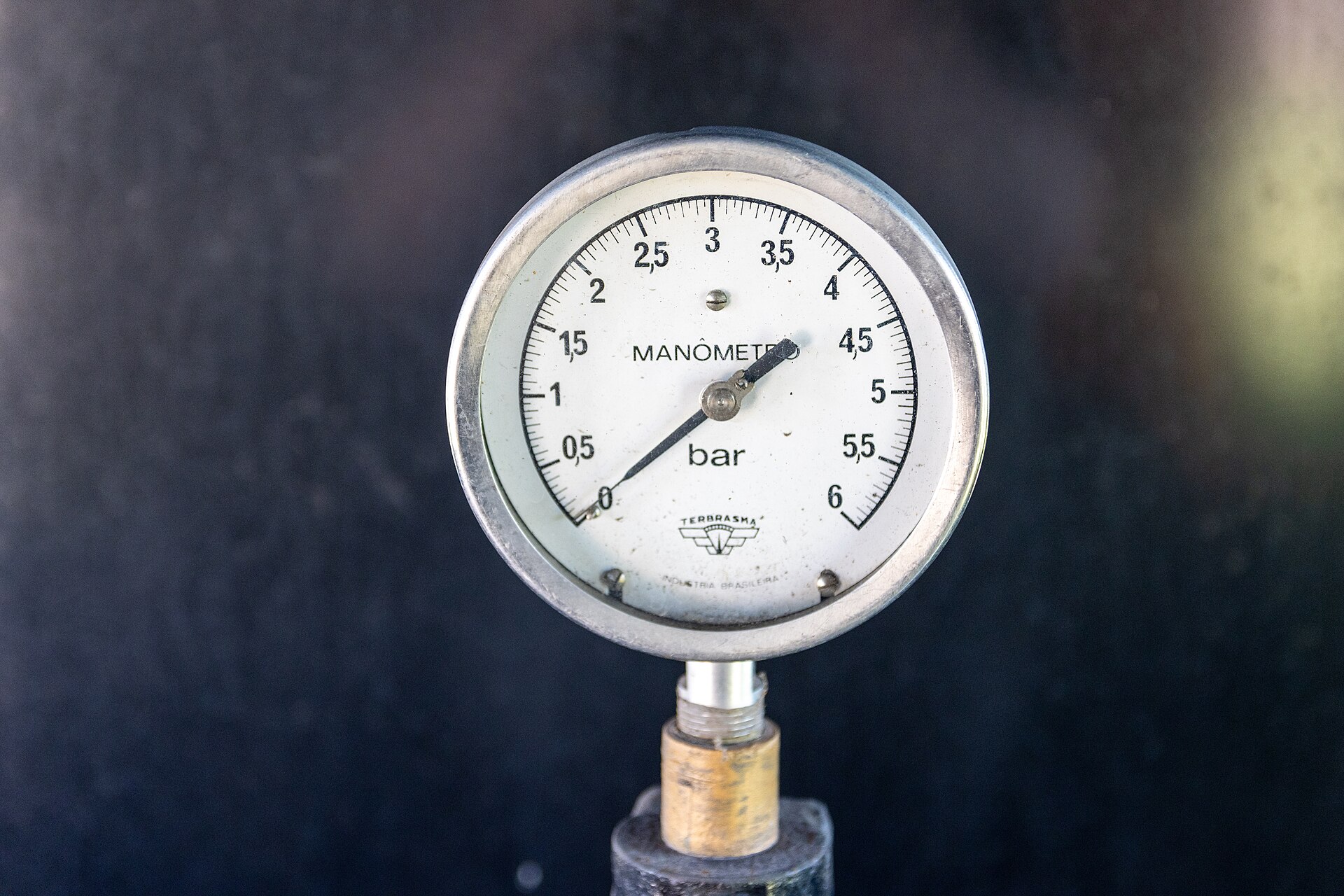
Gauges and gauge faces. The round dial in a bezel is the most-borrowed object in the aesthetic. A real pressure gauge contributes its bezel, its glass, its needle, and its graduated face; a re-faced gauge can become a genuine display element on a meter-movement clock. The caution is § 3.9’s: a gauge that shows nothing is a decoration competing with the display.
Knurled knobs and thumbscrews. Knurling exists because a hand must turn something without a tool; it is functional ornament of exactly the kind Vol 2 § 2.2 describes. Turned brass knobs, knurled collars, and thumbscrews on adjustments are period-correct and cheap to make on a lathe.
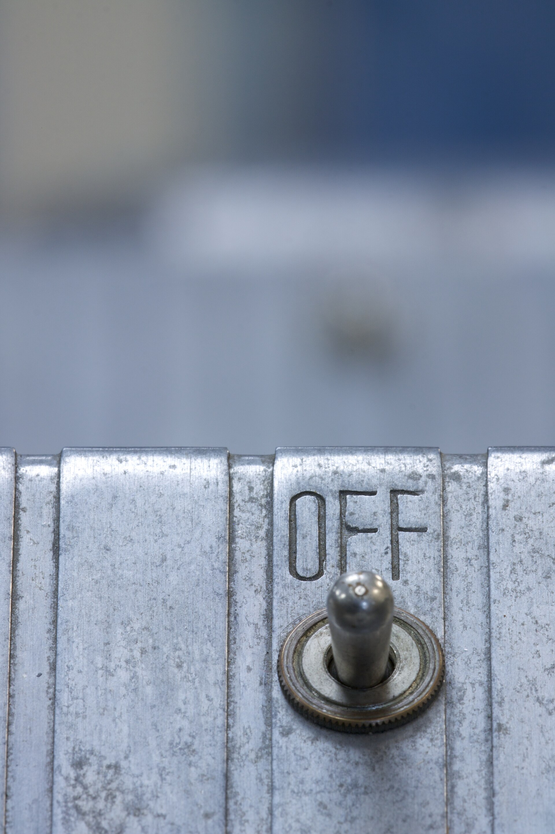
Toggle switches, rotary switches, and indicator jewels. The control vocabulary. A panel-mount toggle with a bat handle, a rotary switch with a pointer knob, and a coloured glass indicator jewel over a lamp are all genuinely of the period — the later, aircraft-panel end of it — and all of them give a clock somewhere honest to put its set and mode controls. Hiding the controls, as several collected builds do by putting micro-switches underneath the case, is the alternative strategy and is equally valid; what does not work is a period panel with a modern tactile button on it.
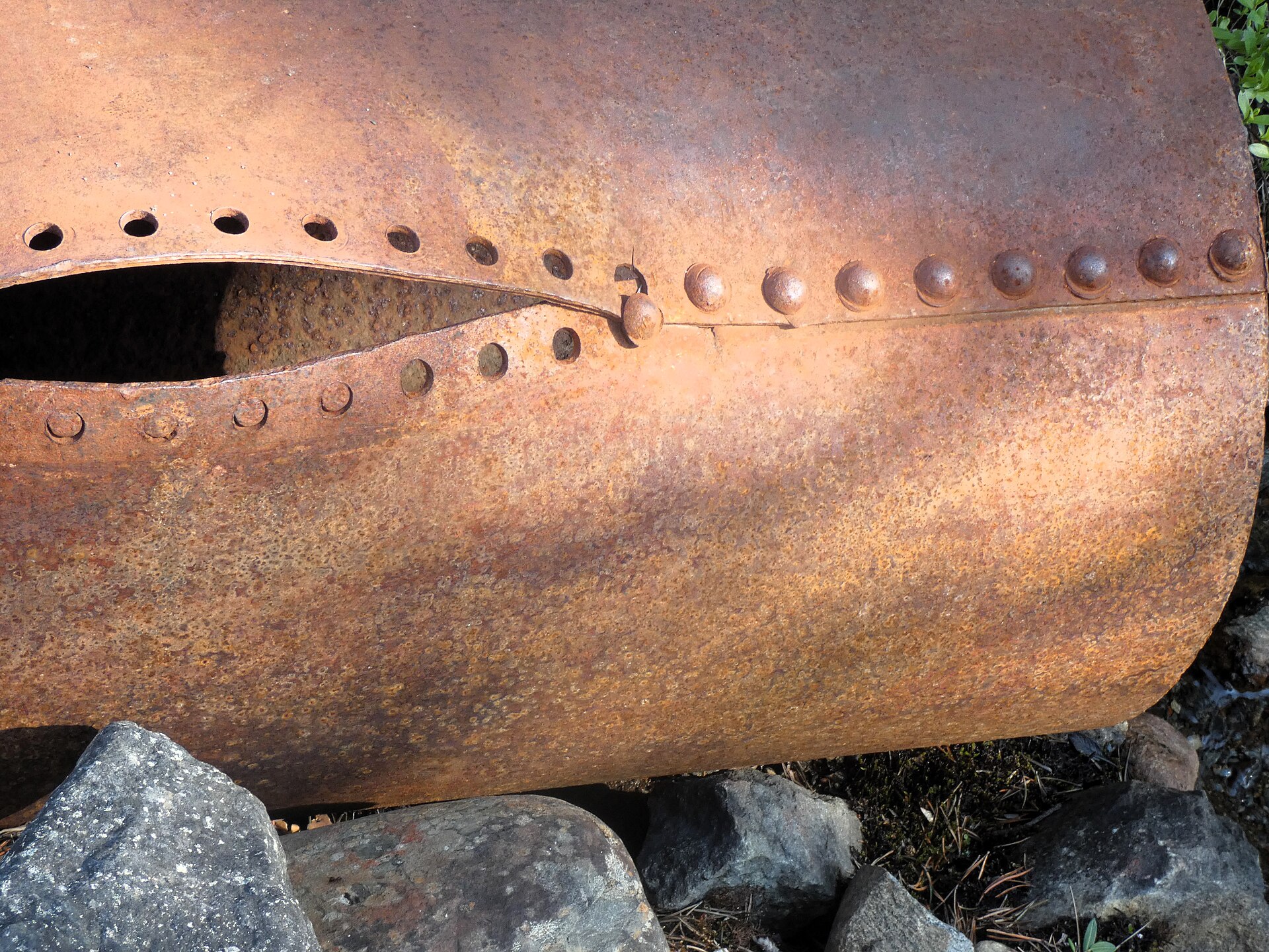
Rivets. Structural fasteners that are visible because they must be. Real riveted seams — overlapping plate with a regular row of domed heads — are an industrial rather than an instrument motif, and they scale badly: a row of rivets at 6 mm pitch on a small desk clock reads as decoration, while the same detail at the scale of a boiler reads as construction.
Pipe and fittings. Elbows, tees, unions, flanges, valves, and handwheels, in copper or brass, used as structure (Vol 4 § 4.5). A valve that turns nothing is the plumbing equivalent of a glued-on gear; a union that actually joins two sections is not.
Threaded rod, all-thread, and standoffs. The quiet workhorses. All-thread is the registration and clamping method of the laminated plinth (Vol 4 § 4.3.1), and threaded standoffs are what hold the sandwich case together — and, in insulating form, what holds the high-voltage board off everything else (Vol 6 § 6.3).
Slotted screws. Period-correct where hex sockets are not. Drive them with a hollow-ground driver that fills the slot, or they will be marked on first assembly.
3.6 Light
The display is the primary light source, and this section exists mostly to argue for restraint about everything else.
The display’s own glow is the focal point, and its apparent richness is a function of the contrast between it and its surroundings, not of its own brightness. Anything that raises the ambient light near the tubes lowers the perceived quality of the glow. This applies with particular force to a dim vector CRT trace and with real force to every glow tube.
Underglow is nevertheless near-universal in the collected material, usually blue or amber, washing up around the tube bases. The mechanism is almost always an edge-lit acrylic plate or a small LED hidden below the tube line. The collected lantern build documents its version precisely: a single 3 mm blue LED per chamber, hidden below the bezel line where the acrylic tube ends, with both ends of the acrylic tube painted white to bounce the light uniformly — a detail that turns a point source into an even glow and that would not be obvious from looking at the finished object. Three such LEDs were wired in series across a 9 V AC supply, taking roughly 3 V each directly from the AC input, with the note that polarity is not an issue at mains frequency.
That build also records the one safety detail that belongs here rather than in Vol 6: the LED conductors were deliberately insulated because a brass gear sat directly above them. Decorative metal above wiring is a hazard even at low voltage.
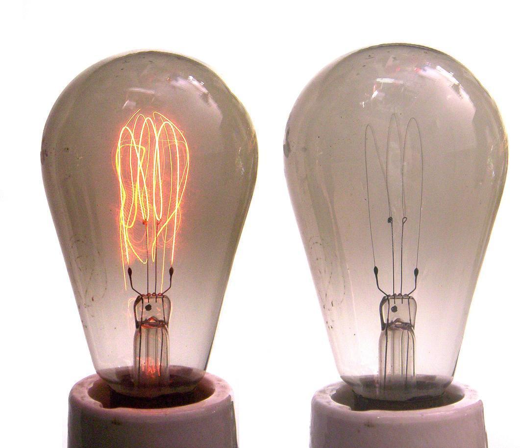
Filament lamps. Carbon- and early tungsten-filament lamps, with their visible hairpin or looped filaments and warm low output, are the period lighting motif and appear throughout the gallery. They suit the aesthetic exactly because they are dim: a filament lamp near a display adds atmosphere without flooding it.
Backlit legends and jewelled indicators are the third, smallest layer — an illuminated nameplate, a coloured jewel over a pilot lamp. Keep them low, warm, and pointed away from the display.
The working rule for all three: added light should be visible as a source and invisible as illumination. If it is lighting the object, it is too bright.
3.7 Exposed mechanism, properly understood
“Exposed mechanism” is the aesthetic’s central idea and the one most often misapplied. What the Victorian and Arts and Crafts sources of Vol 2 actually exposed was working structure: the frame that holds, the gear that drives, the fastener that fastens, the wire that carries. What the commercial style exposes is a simulation of it.
For a clock, the honestly exposable elements are:
- The display glass itself, which is genuinely a visible mechanism.
- The structure — frames, standoffs, brackets, the all-thread through a laminated plinth, the pipe that is holding the tubes up.
- The wiring, when it is dressed well enough to bear looking at. Under a bell jar this is not optional (Vol 4 § 4.4).
- The boards, if they are laid out and finished to be looked at. A board with a ground plane, a considered silkscreen, and a tidy component layout is a legitimate decorative element; the exposed-PCB style in the collected gallery is built on exactly that.
The dishonest version is the loose gear that meshes with nothing, discussed in Vol 2 § 2.4 and worth the repetition because it is the single commonest mistake in the aesthetic.
3.8 Surface and texture
Four textures do most of the work, and all four are covered as processes in Vol 5.
Polished and rubbed-through metal — a darkened surface with the high points brought back to bright, which is how age actually looks on a handled object.
Crackle and wrinkle finish — the granular paint texture of mid-century military and instrument cases. It reads as equipment instantly and is available as an aerosol.
Engraved and filled lettering — a legend cut into metal and filled with wax or paint. The maker’s plate is the signature application.
Machined texture — fluting, beading, turned concentric rings, and knurling, which are ornament produced by the operation that made the part rather than applied afterwards. The finned and fluted case sides visible on several collected builds are this, and where those flutes are also vents they are doing two jobs at once (Vol 6 § 6.4).
3.9 Composition: the rules of restraint
The vocabulary above is long, and the temptation is to use all of it. The collected material is unambiguous that the best builds do not.
- One focal point. The lit display. Everything else is setting.
- One quiet field. A plain surface immediately around the display.
- One cool accent in a warm scheme, or the reverse — the nickel bezel against walnut.
- One family of fasteners. Vol 4 § 4.10.
- One legend. A maker’s plate or a panel legend, not three.
- Every element does a job. Vol 2 § 2.6’s first test, restated as a composition rule.
A useful diagnostic: describe the object in one sentence without using the word “and” more than twice. A build that cannot be described that way has no composition, only inventory.
3.10 References (Vol 3)
Lantern-Clock.pdf,02-inputs/— the nickel-plated gauge bezels used as structural tube mounts (§ 3.5), the contrasting walnut and maple (§ 3.2), the clear acrylic tube chambers (§ 3.3), and the documented underglow: a 3 mm blue LED per chamber hidden below the bezel line, tube ends painted white for uniform bounce, three LEDs in series across a 9 V AC supply, with the LED conductors insulated because of the brass gear above them (§ 3.6).Steampunk Nixie Tube Clock(Instructables),02-inputs/— copper tube and soldered fittings used as structure, and brass candle-holder hardware (§ 3.1, § 3.5).- Steampunk reference gallery,
02-inputs/reference_gallery/— the recurring palette, hardware, and lighting motifs surveyed in this volume, with the provenance caveat of Vol 1 § 1.3.1. - Vol 2 of this series — the Victorian instrument, industrial, aviation, and Arts and Crafts sources each element of the vocabulary is borrowed from.
- Vols 4 and 5 of this series — the constructions these materials are made into, and the processes that produce the surfaces of § 3.8.
- Vol 6 of this series — the point at which the conductive half of this palette becomes an electrical question.
- Figure photograph credits are recorded verbatim in
photo_credits.txt.
Comments (0)