Steampunk · Volume 2
Where the Look Comes From
A label coined as a joke in 1987, a design vocabulary borrowed from real Victorian instruments, and the difference between the two
A builder can produce a perfectly convincing steampunk clock without knowing any of what follows, in the same way a cook can follow a recipe without knowing where the dish came from. The reason to know it anyway is that the aesthetic has a marketing version and a real version, and they give different advice. The marketing version says that steampunk is gears and goggles, that more cogs are better, and that the look is achieved by applying decoration to a finished object. The real version — the one visible in the Victorian instruments the style is actually copying — says almost the opposite: that the appeal is honest structure made visible, that the ornament is usually structural or functional, and that the most convincing objects are the ones where nothing was glued on at all. A builder who knows which tradition they are working in makes better decisions about proportion, about hardware, and about when to stop.
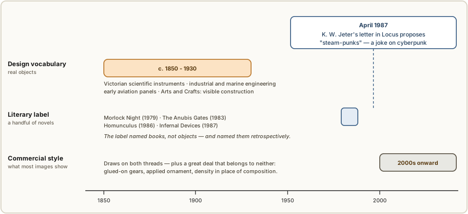
This volume traces three separate threads that got tangled together under one word: a literary label with a precise and slightly absurd origin, a design vocabulary that predates the label by a century and owes it nothing, and a commercial style that followed both. They are genuinely distinct, and the confusion between them is the source of most bad advice about the aesthetic.
2.1 The 1987 coinage
The word has a documented origin, an author, and a date, which is unusual for a design movement. It was coined by the novelist K. W. Jeter in a letter published in the science-fiction trade magazine Locus in April 1987. Jeter was not naming a design style; he was looking for a collective noun for a handful of writers, himself included, who were setting fantastical novels in the nineteenth century, and he proposed one as a deliberate joke on the then-current term cyberpunk. His formulation was:
Personally, I think Victorian fantasies are going to be the next big thing, as long as we can come up with a fitting collective term for Powers, Blaylock and myself. Something based on the appropriate technology of the era; like “steam-punks,” perhaps…
Three things about that are worth holding onto, because each of them cuts against a common assumption.
It was a joke. The hyphenated “steam-punks” is a pun: cyberpunk had named a near-future style built on computing, so a Victorian-set equivalent would be built on the “appropriate technology of the era.” The tone is explicitly light, and the ellipsis is Jeter’s. A term coined this way carries no manifesto and no design rules, which is precisely why the design vocabulary that later attached to it had to come from somewhere else.
It named books, not objects. The three writers Jeter meant were himself, Tim Powers, and James Blaylock. The novels in question were published across the preceding decade: Jeter’s Morlock Night (1979) and Infernal Devices (1987), Powers’s The Anubis Gates (1983), and Blaylock’s Homunculus (1986). None of them is a design document. They describe a Victorian London with anachronistic machinery in it; they do not specify a palette, a finish, or a joint.
It was retrospective. By the time the label existed, the books it described had been appearing for eight years. This is the normal pattern for such terms, and it matters here because it means the fiction was never designed to a steampunk aesthetic — the aesthetic was assembled afterwards, by other people, from other sources.
2.2 The ancestry the label was applied backwards to
Once the word existed it was promptly applied backwards, and the two names it reached first were Jules Verne (1828–1905) and H. G. Wells (1866–1946). This is where a genuine and useful distinction gets lost, and it is worth restoring because it explains why real Victorian objects look different from things made to look Victorian.
Verne and Wells wrote contemporary speculative fiction. The submarine in Twenty Thousand Leagues Under the Seas (1870) and the machine in The Time Machine (1895) were extrapolations from the technology their authors could see out of the window — written forwards, from the inside of the period. Jeter, Powers, and Blaylock wrote historical fantasy, a century later, looking backwards at a period they knew was over and whose visual character they could treat as material. The first group was imagining the future; the second was quoting the past.
The design consequence is direct. Anything genuinely Victorian was designed to look current, not old. A brass theodolite, a marine chronometer, a pressure gauge, or a laboratory balance from 1880 was a modern precision instrument, finished to the standard of its day, with its ornament kept to what the manufacturing process and the customer’s expectations produced — a knurled edge because a hand must turn it, a beaded rim because that is how sheet was stiffened, an engraved scale because that is how a scale was made. Nothing on it was applied to make it look like 1780. Objects made in the style, by contrast, are quotations, and the characteristic failure of a quotation is that it over-signals: it adds the marks of age and craft as decoration, in quantities that no working instrument ever carried.
This is the single most useful thing the history offers a builder, and Vol 3 turns it into a working rule.
2.3 Where the design vocabulary actually comes from
The material and formal language of a steampunk clock did not come out of the novels. It came from surviving objects, and they fall into four groups that a builder can actually study.
2.3.1 Victorian scientific and laboratory instruments
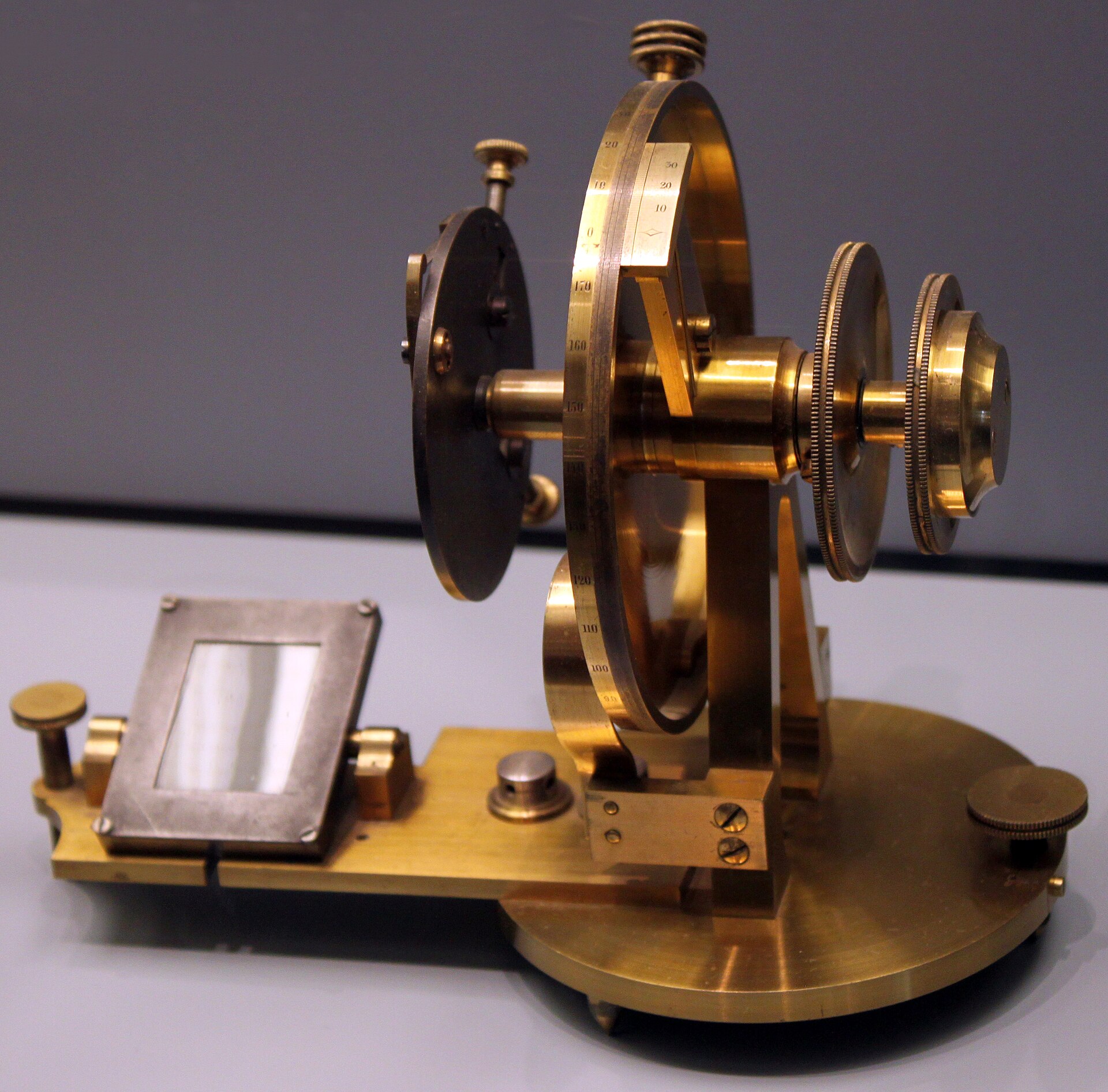
The densest single source. Nineteenth-century scientific instruments established most of the vocabulary the aesthetic now runs on: lacquered brass as the default instrument metal; turned bezels and knurled adjusters; engraved scales filled with black wax; mahogany cases with brass corner brackets and a fitted, baize-lined interior; bell jars and glass domes over delicate mechanisms; and hardware — slotted screws, thumbscrews, levelling feet — that is visible because it has to be reachable. A period laboratory catalogue is a better design reference than any modern steampunk image board, and the engravings in them are usually old enough to be in the public domain.
2.3.2 Industrial and marine engineering
The heavier half of the palette: riveted plate, copper and brass pipework with threaded fittings and unions, valves and handwheels, cast iron painted or left to rust, and the pressure gauge, which is the single most-borrowed object in the whole aesthetic. Marine and locomotive practice contributes the portholes, the beading, the bronze, and the habit of building things heavy enough to survive being kicked.
2.3.3 Early aviation and military instruments
Slightly later — roughly 1910 to 1950 — and strictly speaking outside the Victorian period, but so consistently used that it belongs in the list. This is where the round black-faced gauge in a bezel, the crackle or wrinkle-finish panel, the engraved legend plate, and the panel-mount toggle switch and indicator jewel come from. The collected inspiration material in this subproject includes exactly such an item — an aircraft-instrument housing — and the archetype it belongs to is a staple of the gallery. Builders reach for it because it delivers “instrument” instantly, at the cost of being a few decades out of period. That trade is worth making consciously rather than by accident.
2.3.4 Arts and Crafts, and the idea of honest material
Less often credited and more influential than the gears. The Arts and Crafts movement of the later nineteenth century argued for visible construction, honest materials, and evident handwork against machine-made ornament applied to hidden structure. That is the same argument the best steampunk builds make: a through-tenon or an exposed brass fastener is not a decoration pretending to be structure, it is structure allowed to be seen. When a build “reads” as authentic rather than costumed, this is usually why.
2.4 The marketing version, and what is wrong with it
From the 2000s onward the word attached itself to a commercial style, and that style is what most search results and most of this subproject’s reference gallery actually show. It has three recognisable habits, and all three are worth resisting.
The cog fallacy. Loose gears are glued to surfaces in decorative arrangements where they mesh with nothing and turn nothing. This is the most common single feature of commercial steampunk product and is essentially absent from real Victorian instruments, where a visible gear is visible because it is working. The best of the collected builds obey the real rule: the gears in them either drive something, hold something, or are structural — in the collected lantern build, for instance, a pair of brass gears is trapped between two bezels and serves as the actual clamping assembly that holds the fixture together, with a cross-drilled gear hub carrying the swing pivot. That is a gear doing a job. A gear hot-glued to a lid is not.
Ornament as a finish step. The style encourages decorating an object after it works, which produces the applied look. The alternative, which every convincing build follows, is to make the decorative elements be the construction: the bezel is the tube mount, the pipe is the frame, the nameplate covers the fastener holes, the fluting is machined into the case rather than stuck on it.
Density over composition. Commercial pieces tend to maximise the number of visible elements, on the theory that more brass is more steampunk. Real instruments are sparse: a large plain surface, a small number of controls, one legend, and a single focal point. The clock’s display is the focal point — the one genuinely luminous thing in the object — and every added gauge competes with it.
A useful sanity check, drawn from the audit described in Vol 1 § 1.3.1: the images in the reference gallery that turn out to be synthetic rather than photographic are overwhelmingly the ones exhibiting all three habits at once. Impossible density is a tell. If a reference image looks like the most steampunk thing ever made, that is evidence it was never made.
2.5 Why glow-tube displays suit the aesthetic so well
The pairing of Victorian styling with nixie, VFD, numitron, dekatron, and small-CRT displays is not arbitrary, and it is not only that the tubes are pretty. Three things line up.
The display is itself an obsolete technology. A nixie tube was a current product in 1960 and has been obsolete since roughly the mid-1970s; a magic-eye tube and a dekatron are older still. Putting genuinely superseded technology inside a fantasy of superseded technology is a consistent move, in a way that putting a modern LCD behind brass is not. The anachronism matches.
The light is the right colour and the right quality. Neon’s orange, a VFD’s blue-green, a filament numitron’s dull amber, and a CRT phosphor’s green are all warm or soft, low-output, and visibly emissive rather than backlit. They read as fire, filament, and discharge rather than as a screen. This is also why Vol 3 argues for restraint with added lighting: ambient light near the display flattens exactly the quality that made it attractive.
The tube is a glass object that wants to be exposed. The whole aesthetic is built on showing the mechanism, and a glow tube is a mechanism you can see working — visible electrodes, visible structure, a visible discharge. It rewards the bell jar, the open frame, and the bezel-framed aperture in a way a flat display never will.
The corollary is the constraint the rest of this series is organised around: the display technologies that suit the look best are, with the exception of the numitron and the meter movement, the ones that run at dangerous voltages. The aesthetic and the hazard arrive together. That is not a coincidence to be worked around; it is a fact to be designed for, which is Vol 6.
2.6 Three tests to take to the bench
The history condenses into three questions worth asking of a design before committing to it. They are the practical residue of everything above.
- Does every visible element do something? Structure, mounting, adjustment, sealing, legend, or handling. If an element’s only job is to say “steampunk,” the build is quoting the marketing version. A deliberate exception is fine; a build made entirely of exceptions is a costume.
- Would this have been finished this way when new? A real instrument was clean, crisp, and current. Ageing is a legitimate choice — Vol 5 covers how to do it — but it should be applied as a considered layer over a well-made object, not used to disguise a poorly made one. Distress is not a substitute for fit.
- Is there one focal point? The lit display. Everything else is setting. If three elements compete, the design is denser than any period object it is imitating.
2.7 References (Vol 2)
- K. W. Jeter, letter published in Locus, April 1987 — the coinage of “steam-punks” as a collective term for the Victorian fantasies of Jeter, Tim Powers, and James Blaylock, framed explicitly as a play on cyberpunk. Quoted in § 2.1.
- The novels the term was coined for: K. W. Jeter, Morlock Night (1979) and Infernal Devices (1987); Tim Powers, The Anubis Gates (1983); James Blaylock, Homunculus (1986).
- The nineteenth-century speculative fiction the label was later applied backwards to: Jules Verne, Twenty Thousand Leagues Under the Seas (1870); H. G. Wells, The Time Machine (1895). The distinction drawn in § 2.2 — contemporary extrapolation versus later historical pastiche — is this series’ own framing, not the authors’.
Lantern-Clock.pdf,02-inputs/— the source of the structural-gear example in § 2.4: brass gears trapped between nickel-plated gauge bezels as the clamping assembly, with a cross-drilled gear hub carrying the swing pivot.- Steampunk reference gallery,
02-inputs/reference_gallery/— the commercial-style corpus described in § 2.4 and audited in Vol 1 § 1.3.1 and Vol 7. - The Arts and Crafts argument for visible construction and honest materials (later nineteenth century) is summarised in § 2.3.4 from the movement’s general principles; no single source is cited and none should be inferred.
Comments (0)